5 min czytania
Jak wybrać styl portretu na podstawie zdjęcia
Wybór stylu to nie kwestia abstrakcyjnego gustu. Zależy od trzech konkretnych rzeczy: co widać na Twoim zdjęciu, gdzie zawiśnie wydruk i po co go w ogóle robisz.

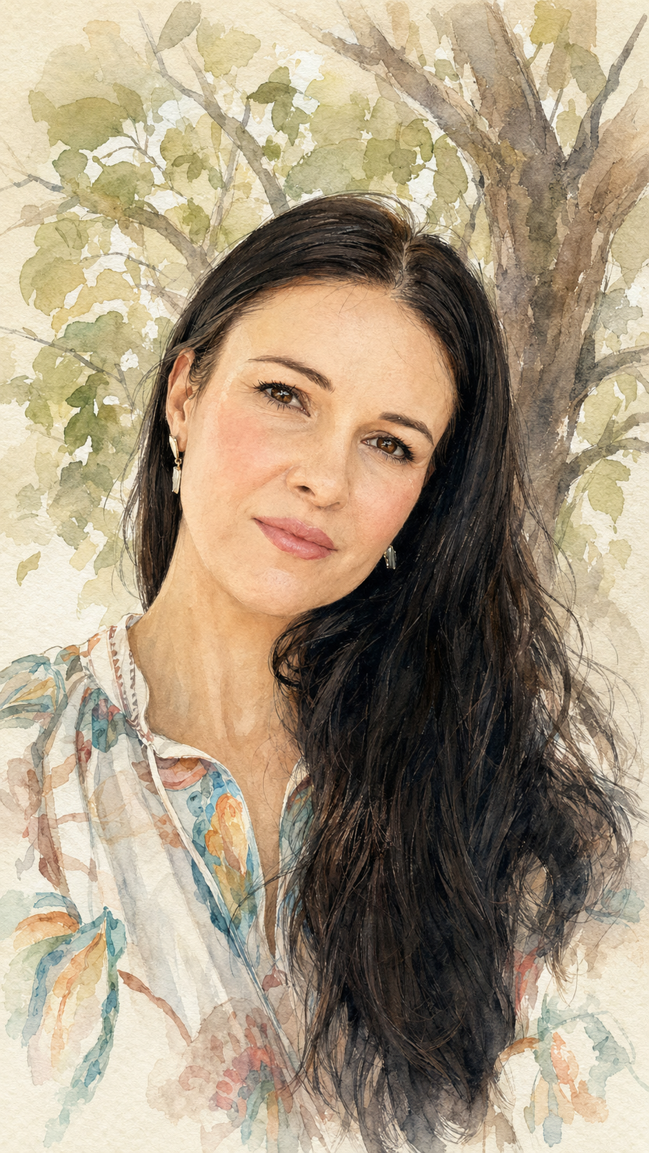
Zacznij od zdjęcia
Jeśli kolor jest częścią wspomnienia — ogród, letnia sukienka, rudy kot, światło o złotej godzinie — akwarela to zachowa. Zamień to samo zdjęcie na grafit, a stracisz właśnie to, co skłoniło Cię do wyboru tej fotografii.
Jeśli zdjęcie opiera się na strukturze — wyrazista twarz, charakterystyczne rysy, wąsy kota, zabytkowy budynek — mocniejszym wyborem jest ołówek. Ton i linia lepiej podkreślają formę niż akwarelowe zacieki.
Potem spójrz na wnętrze
Sztuka częściej zawodzi na ścianach niż na ekranach, a wnętrze decyduje bardziej, niż się zwykle sądzi.
Akwarela sprawdzi się w
Salonach, kuchniach, pokojach dziecięcych i sypialniach; przy jasnych lub ciepłych ścianach; we wnętrzach z drewnem, lnem i roślinami.
Ołówek sprawdzi się w
Przedpokojach, klatkach schodowych, gabinetach i biurach; w monochromatycznych lub kontrastowych wnętrzach; na ścianach, gdzie inne dzieła są już kolorowe.
Na koniec pomyśl o okazji
Prezenty na radosne okazje — narodziny dziecka, ślub, urodziny — zwykle wymagają ciepła, co wskazuje na akwarelę.
Portrety pamiątkowe i upamiętniające zwykle wymagają wyciszenia, co wskazuje na ołówek. Więcej na ten temat piszemy w naszym poradniku o portretach pamiątkowych.
Kiedy naprawdę nie możesz się zdecydować
Odblokuj oba style. Każdy z nich to 40 zł z tego samego przesłanego zdjęcia, więc posiadanie obu kosztuje mniej niż pojedyncza kartka okolicznościowa i kawa. W cenie masz gotowy do druku plik PDF oraz wydrukowany egzemplarz w formacie 30 × 40 cm, wysyłany do Ciebie bezpłatnie na terenie Polski.
Częsty schemat: akwarela wydrukowana w dużym formacie na własną ścianę, ołówek w mniejszym jako prezent.
- Zobacz oba style przed zapłatą — podgląd z watermarkiem jest darmowy
- Porównaj je w rozmiarze, w jakim planujesz je wydrukować, a nie na ekranie telefonu
- Zapytaj samego siebie, który z nich chciałbyś oglądać jeszcze za dziesięć lat
Szybka tabela decyzyjna
Jeśli szukasz jednej zasady: kolorowe wspomnienie, kolorowe wnętrze, radosna okazja oznacza akwarelę. Zdjęcie oparte na strukturze, stonowane wnętrze, formalna okazja oznacza ołówek.